This assignment has been very challenging to say the least! I love playing with the paint and the collage pieces, but getting the color down and then covering the collage is tricky. I am now trying to rework this piece to add more activity to the collage and then adding to the foreground in such a way that won't detract from the horizon.
 |
| version 2 |
 |
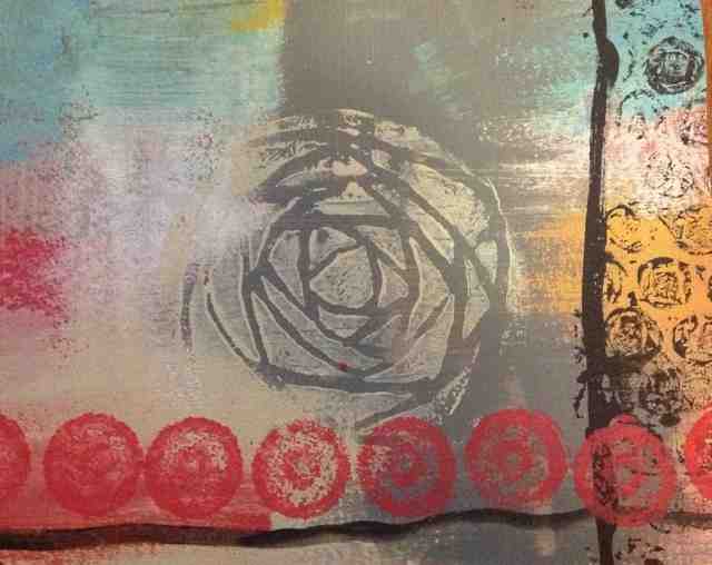
| version 1 |
To me, this one looks like a city neighborhood. It is a busier collage than all my others, and I like the "signage" at right. Didn't like the brown foreground, but the texture is nice. I may try to brush some of the sky color over it to catch on some of the texture.