Luke
Sunday, November 3, 2013
Lesson 3 Cruciform
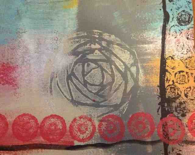
Repainted and reworked this to the extent that the collage papers were beginning to disintegrate! It was beginning to feel messy, so I stopped. I wanted to create depth in the piece by adding shadow around the cruciform, but I was challenged to find the right color and also make a subtle transition from the shading to the lighter background color. The 4 quadrant background colors all turned out to be about the same, so an attempt at variety was established through the texturing.
Jane said to keep working this one, so here it is. Had a hard time making the quadrants different colors. The added red paint and collage really did nothing to improve the composition. It's a bloody mess. Don't like it at all, so I'm abandoning it for good now!
This next one was also worked over and over. Probably too busy with the textures, and the cruciform is perhaps too static. But...
I rather like the one below and the blue one at the top!
Monday, October 28, 2013
More Lesson 2 horizon focus
This assignment has been very challenging to say the least! I love playing with the paint and the collage pieces, but getting the color down and then covering the collage is tricky. I am now trying to rework this piece to add more activity to the collage and then adding to the foreground in such a way that won't detract from the horizon.
![]() |
| version 2 |
![]() |
| version 1 |
To me, this one looks like a city neighborhood. It is a busier collage than all my others, and I like the "signage" at right. Didn't like the brown foreground, but the texture is nice. I may try to brush some of the sky color over it to catch on some of the texture.
Saturday, October 26, 2013
More horizons
The more I work on this project, the more frustrating it gets! Jane's feedback for the earlier posts (the first 3 for Lesson 2) said I should try for more contrast between the sky and foreground colors. I find this very difficult to do, especially on the larger pieces, because of needing to go back and forth between the 2 colors and dealing with a dry palette, having to recreate the color, and then it goes on with difficulty because the paint underneath isn't completely dry nor is it fluid enough to take the new coat of paint. I need to let the piece totally dry in between, which, of course, makes it impossible to wipe off paint to achieve the desired contract in the right places. So it's a balancing act for which I am unbalanced!
The piece directly below (5 x 6) does not have the contrasting sky and foreground, but I like the softness of it, and I like the horizon even though the top pieces are even.
The yellow piece was a nightmare because of the paint problems described above. It is a larger piece at 7.5 x 9.5, and there is more contrast in real life--the sky is blue-green and the foreground is grayish-yellow. The entire piece is "enhanced" with quinacridone nickel azo gold, there were no pre-background text layers, and I added the music scraps afterwards for more interest.
The last piece (also 5 x 6) was another difficult one because of the paint problems. I had mixed phthalo blue, burnt umber, and raw sienna with a tad of white for the bottom, and I used a "sea glass" craft paint mixed also with a tad of white for the top. The painting of the collage was difficult because of the open spaces and the transition of the sky and ground colors between the open gaps. The paint kept drying up regardless of adding glaze medium and then the brush would stick when I tried reapplying to a less-than-dry, less-than-wet base. Really frustrating. I finally then added a little interest with a dry brush of my phthalo blue mixture, a few more strips of collage, and then I called it a day.
Friday, October 25, 2013
Wednesday, October 23, 2013
Lesson 2
These were fun small (5 x 6) experimental pieces on the "horizon" focal-point compositions done during work breaks. :)
Saturday, October 19, 2013
Jane's Dynamic Composition, Lesson 1
All the challenges in this assignment!
My first attempt was the green/yellow-green color palette. Trying to stick to the palette was difficult and I wasted a lot of paint! My next challenge involved the infinite possibilities of positioning various sizes of squares and rectangles, and then making a mess with the matte medium. I also added stash scrap that violated the rule of "no diagonals" before I realized I had done so. This was not my favorite piece.
The yellow palette was more fun. I enjoyed creating the color swatches and found it easier to stay within the parameters. The background seems to blend nicely with the swatch colors.
The purple/red composition was fun to create but difficult to photograph. I used some white paint in the background that really shows in the photos. The palette is mostly purple and red, but the photo makes it look more contrasty than it really is. I think all of my pieces are busier than I like.
I really enjoyed having parameters within which to work, and at the same time, so much freedom. This has been fun.
On to lesson 1, project 2!
I dislike the inconsistent color application made by the brush strokes.
Sunday, October 13, 2013
Saturday, July 13, 2013
Saturday, May 25, 2013
Postcards
Sunday, May 12, 2013
Little book
I received one of these from a friend a while ago and I treasure it. Decided to try my hand at making one today. I'm so pleased with the new decorative papers I got from Blick--as shown on the cover. The real challenge was coming up with a theme for the inside. Making the little book was lots of fun though!
Thursday, November 1, 2012
Monday, October 8, 2012
Grandparents
I don't have a scanner, so I took pictures of pictures...the journal page is my grandmother, Florence, and grandfather, Abe, taken in 1907. Below that is a photo of both grandparents taken in 1957, from left to right: Anna V., Abe D., Paul V., Florence D.
My grandparents from my father's side, who lived in the Adirondack region of NewYork, used to take me for rides in the country after dinner.
I remember they had a framed print of the 23rd Psalm hanging in their home. For some reason, it comes to mind:
23rd Psalm
1 The Lord is my shepherd; I shall not want.
2 He maketh me to lie down in green pastures: he leadeth me beside the still waters.
3 He restoreth my soul: he leadeth me in the paths of righteousness for his name's sake.
4 Yea, though I walk through the valley of the shadow of death, I will fear no evil: for thou art with me; thy rod and thy staff they comfort me.
5 Thou preparest a table before me in the presence of mine enemies: thou anointest my head with oil; my cup runneth over.
6 Surely goodness and mercy shall follow me all the days of my life: and I will dwell in the house of the Lord for ever.
Reading it now reminds me of how safe I felt when I was in their company.
Saturday, October 6, 2012
Subscribe to:
Posts (Atom)